Your feedback and comments are appreciated. See Contact page for e-mails.
An Intuitive Interface
by Richard Rivera
Great interface design has longevity. It defies trendiness. The box grid appearance is popular and trending right now in web design and tablets, mostly due to the influence of WordPress and Microsoft. Not too long ago and for more than a decade, the dimensional look of drop-shadows and bevels were the trend and the accepted style. The core question: what is an intuitive interface?
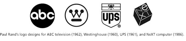
Looking back at the graphic design of the 1960s, for example the designs of Paul Rand,1 it is easy to see his concepts clearly communicated through typography, iconography, and flat colors. His emphasis on graphical forms places it firmly in-sync with the current style of today. What is old is new.
The key to an intuitive interface is to rely on graphic forms and principles of design that direct the eye, and allow the viewer to easily navigate from one page to the next.
Another key element to employ is symbolism that is quickly understood. For instance, in 1984 when Susan Kare2 designed the Apple Macintosh icons every one understood the symbols of the Trash Can, Pencil, Paint Brush, Folder, Magnifying Glass, Happy Mac, Sad Mac, etc. If your users do not understand your iconography or navigational approach, it will remain unused except to the most diehard users (“investigators” that relish a mystery). Poor interface design leaves us wondering where to go next to navigate the maze. Great interface design is painless and navigation is self-evident.
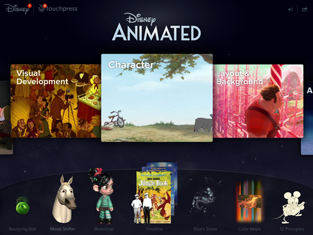
An outstanding example of a great interface is found in the Disney Animated app for the iPad. It is elegant, intuitive, and simple, but easily unveils a path of greater complexity and information. Another notable example is the Beethoven’s 9th app from Touchpress.
Interface design encompasses websites, handheld devices, cameras, ATMs, etc. Users are like a river which will take the path of least resistance. The iPhone interface was a natural extension of the music iPod’s mode of operation, and purposely expanded users vocabulary from pressing grey buttons to viewing and touching brightly colored symbols.
The most intuitive way for people to interact with people are body language, speech, and touch. But the most intuitive way to interact with objects is touch, writing, and speech.
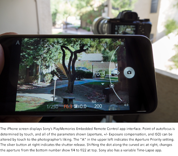
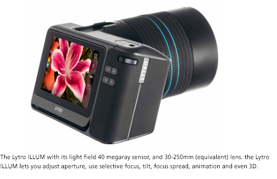
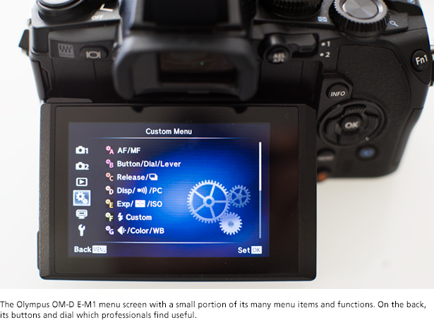
An increasing number of camera manufacturers are employing touchscreens on their cameras and methods of swipe to scroll. Some cameras even have the ability to trigger the shutter and autofocus systems by touching the screen, but very few manufacturers have redesigned their camera interfaces for 21st century standards. The vast majority rely on antiquated menus within menus, and lists that overwhelm and boggle the most experienced photographers.
Nowadays people read less and less. They don’t want to read manuals and few read newspapers. Many prefer videos rather than reading and I don’t think that it is a singular U.S. phenomenon. I believe much of it is influenced by a desire for interactivity fostered by gaming, trackpads, smartphones, and other devices that already employ some intuitive design that play a large part in the tech we use on a daily basis.
The impact of smartphones and touch tablets are everywhere and most evident when we find ourselves “chimp-ing”—touching on a device that is not touch friendly but expecting it to change upon touch. We are usually surprised when it does not respond. What does that say about our own “programming” and expectations? And now that we have a generation of 4-year-olds growing up with iPads and tablets, the longterm effects are inevitable. The change in the next ten years of industrial design and intuitive interfaces will surprise most of us. I welcome it.
1 http://www.iconofgraphics.com/paul-rand/
September 15, 2015
Camera Sense Archives
APRIL 2015
Book review
iPad software
Movie review
Underwater dual-use camera review
Photo commentary
Book review
PhotoTech commentary
The Interview, movie review
Photo enhancement or management
MAY 2015
Photo Tech commentary
Photo/Art commentary
Camera review
TV series review
JUNE 2015
JULY 2015
AUGUST 2015
SEPTEMBER 2015
OCTOBER 2015
NOVEMBER 2015
DECEMBER 2015
Copyright © 2015 Richard Rivera & Rivera Arts Enterprises All rights reserved. No copying or reproduction of any kind without express written permission from Richard Rivera
Legal Disclosure Camera Sense and Eagles of New York are trademarks of Elk Partners LLC